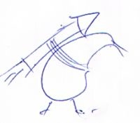
We recently changed our name to KiwiSpace Foundation, and are in need of a logo. The interim one you see at the top of the page was just a placeholder.
We know there are heaps of creative people out there, who are passionate about space – and would love to hear and see your ideas for what our logo can be. It doesn't need to be perfect - a basic sketch is fine. The logo ideas will be reviewed by committee, and then sent to a graphic designer to craft the final design.
Email us your logo ideas by Monday 21 March
Submitting your logos
Simple email the logo – scan it, or simply take a picture of a napkin with your camera phone – to:
Logo Tips & Guidelines
Please consider the following points when coming up with logo ideas. You don't have to fit all of the criteria, but the more suitable the logo is for multiple situations the better.
- KiwiSpace: The name "KiwiSpace Foundation" was chosen, amongst other reasons because we want to be able to use "KiwiSpace" in a more standalone context, with the general public. So maybe the logo doesn't have the word 'Foundation' on it? or maybe there are two variants, etc.
- Colours: How will it look in black and white and single spot colours and full colour.
- Different background: What would it look like on a dark background, or coloured background. Would it be in a a box? Transparent in the middle, etc?
- Different sizes: Think about how the logo would look at different sizes. e.g. the front of an A4 brochure versus a small logo in the credits inside. Will it scale well? or will you not be able to see the detail when it's too small. If blown up to a billboard size, will it still look alright? You could consider having two logos – a simplified one for smaller sizes, which removes some detail that would otherwise be lost. With social media, etc – the most common way people will 'see' the KiwiSpace logo will probably be Facebook or Twitter posts – so the logo (maybe without text) on its own should look good at thumbnail size.
- Vector image preferred: Logos that can be stored as paths/lines are preferred to 'raster art' (pixels – e.g. photos), as they scale better and have smaller file sizes. (Don't worry if you don't can't produce a vector file, but if you logo could be redrawn using paths that'd be great – e.g. avoid photos). http://mcc.yurisnight.net/w/images/1/1c/Logo-YurisNight.png is an example of a logo that can be drawn as a vector graphic.
- What Fonts: Legibility should be of primary concern, but there are heaps of different typefaces out there. A cross-platform typeface is preferred, and certainly one we have rights to use.
- Taglines: We haven't mapped out an official tagline for the organisation yet, but feel free to create some ideas. The logo should work without the tagline though.
- Different Media: Please bear in mind that his logo might be used in various ways:
- Letterhead
- Business cards
- Website banner, social media, etc
- T-shirts
- Car sign-writing
- etc
If you've got any questions, please drop us an email and i'll do my best to answer them.
